Be yourself; Everyone else is already taken.
— Oscar Wilde.
This is the first post on my new blog. I’m just getting this new blog going, so stay tuned for more. Subscribe below to get notified when I post new updates.
Be yourself; Everyone else is already taken.
— Oscar Wilde.
This is the first post on my new blog. I’m just getting this new blog going, so stay tuned for more. Subscribe below to get notified when I post new updates.
From Visual and Design Class
Personal Logo
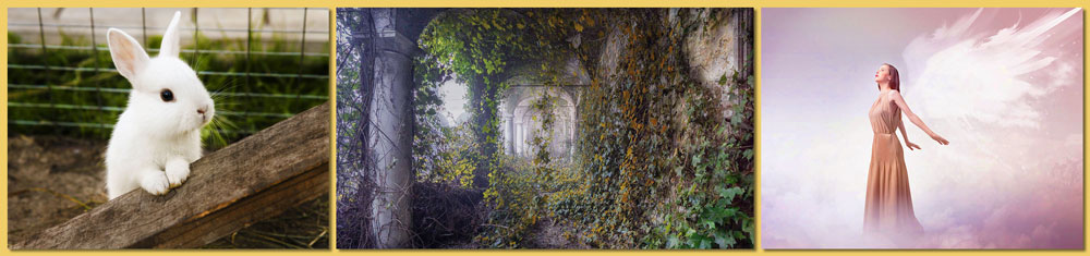
For my first photo-shop, project I wanted to just mess around and figure out how to use the program. I have used Adobe Lightroom before, and I did work a little bit with photo-shop when I took photography class in high school. For my first photo I chose a picture of a rabbit because I like rabbits, and I have one back at home (her name’s Ruby). I wanted to make the colors very vibrant in the photo, so I messed around with the vibrant and saturation settings and did some adjusting to the exposure. I also wanted the rabbit to stand out more, so I did some dodging and burning and darkened the background and everything around the rabbit. For my second photo, I looked up abandoned buildings for inspiration, and I saw the photo and thought it’d be fun to mess around with. Originally, I was going to make everything very saturated, but then I was able to bump up the colors of just the leaves, keeping everything else (background, pillars, etc.) in more muted tones, and I liked that effect. I also did more burning and dodging, and I brightened the pillars and archways, anything that wasn’t covered in leaves, to give them a misty feel. Lastly, I chose a picture of an angel because I wanted to try to edit something with a mythical feel. I wanted to do a simpler edit compared to the first two, so I only adjusted the colors, making them more vibrant since the original photo was so saturated it was almost black and white. Finally, I chose a pastel yellow/orange background since I had used very warm colors in all my edits, and I wanted the background to tie everything together.
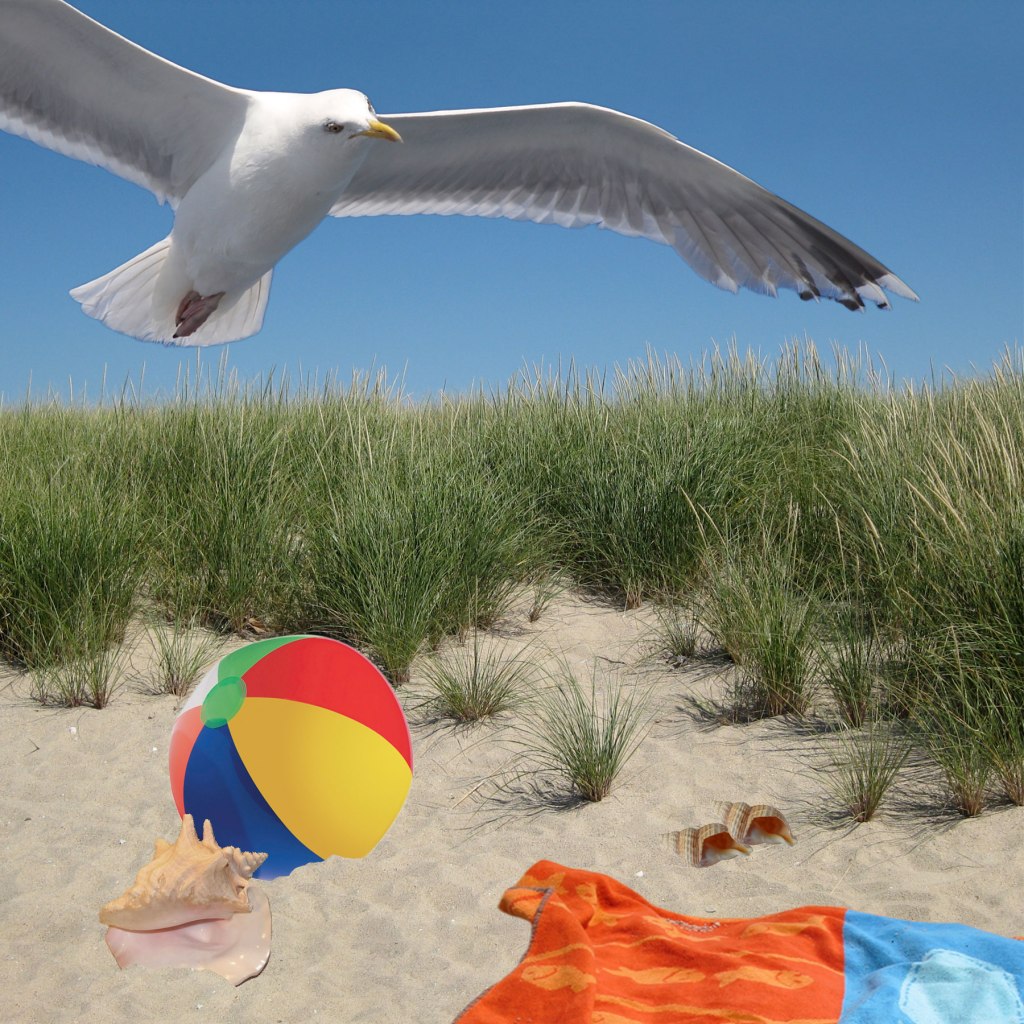
When doing the beach scene, my main goal, of course, was to try and mimic the original picture as much as possible. I mostly used the selection tools to copy the images over. I would use the wand tool and put the tolerance very low and select what I needed. I would then have the original image in the background, lower the opacity of the images in the foreground, and then place and transform the foreground images to the correct size. From that process, along with a couple fine tuning, I was able to closely match the original photo.
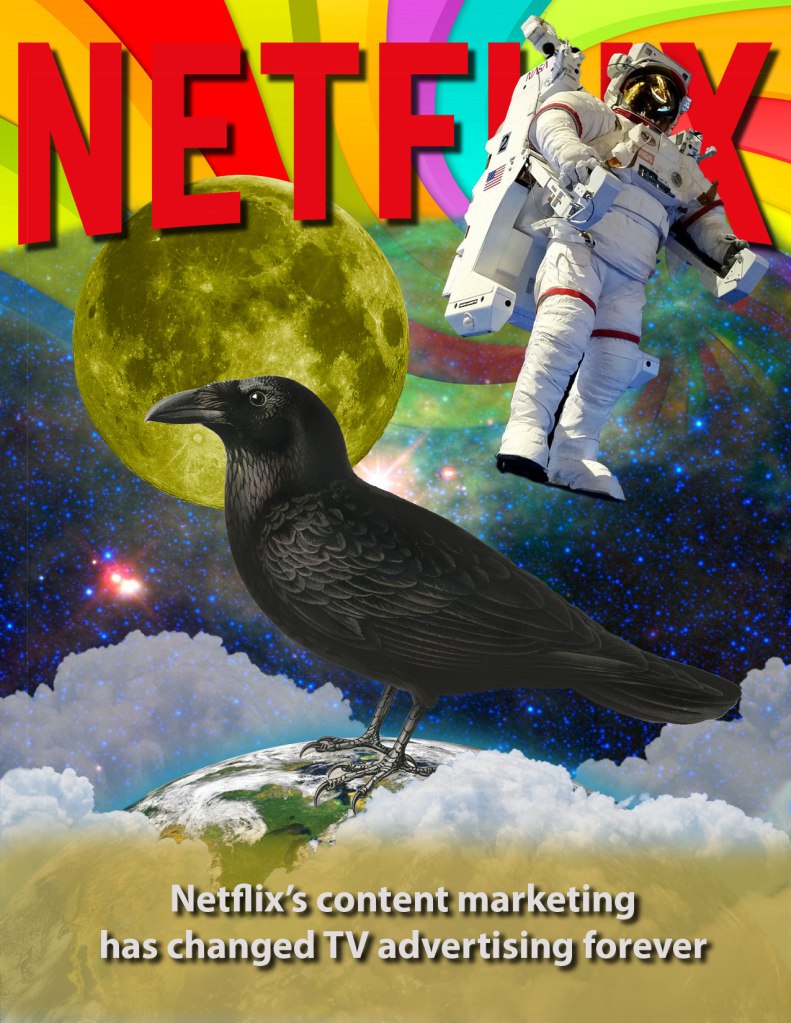
With the composition project, I decided to match the Netflix poster from class as best as I could. There were a lot of different photos I had to use, and I ended up using a lot of layers. I used the wand tool to select the background of the image (since most of the images had a solid color background), I’d then hit inverse, copy and paste. I would also use the brush tool to brush out any of the background that was still there. After that it was all about placing the images in the correct place and to the right size, and I did this by having the original photo in the background and lowering the opacity of the photos in the foreground. I also did some touch ups, adding text and a yellow strip at the bottom using the brush tool. I was pretty happy with the result, and I would say I was successful in matching the original poster.
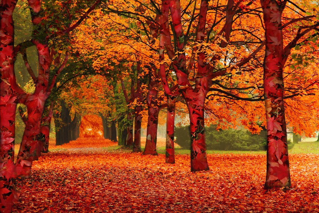
For my design, I decided on a seasonal design topic, more specifically autumn because I like the warm colors that autumn is associated with. When brainstorming, I thought it’d be interesting to overlay autumn leaves over the tree bark, as a way to add more color. The main picture with the trees had mostly orange leaves, and I wanted to bring in some red, hence the red leaves over the bark. I used mostly the masking and brush tools to mask over the different layers, which took a long time. Having to go through all the trees and their branches was very tedious, but also very necessary. Overall I was just trying to play around with different colors to see what worked. I added an image of the sun in the background to give it more depth and make the photo pop more, and to add more orange tones. I added a yellow brush highlight to the background to make it stand out more, as well as bring some yellow into the photo to contrast the red and orange tones. The photo took a long time to complete, but I was very happy with it in the end.
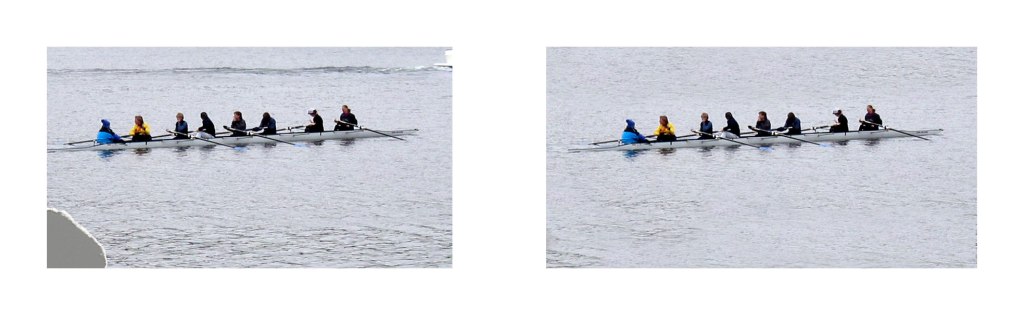
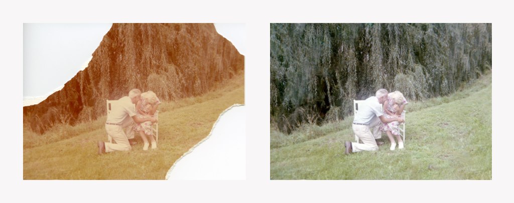
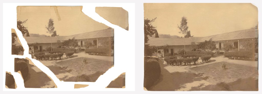
For my three retouching images, I chose the ones I did because I thought they would be the most interesting and challenging to retouch since all three were missing parts of the photo. For the canoe photo, it was using the clone stamp tool to fix the corner and smooth out the water. For the elderly couple, it was again using the clone stamp tool, as well as messing around with brightness and coloring to make the photo look more realistic. And finally with the photo of the park, I had to move around and reassemble all the pieces, then use the clone stamp tool to make it look like the photo was one full piece again. I was very happy with the end results, and I think I did very well.
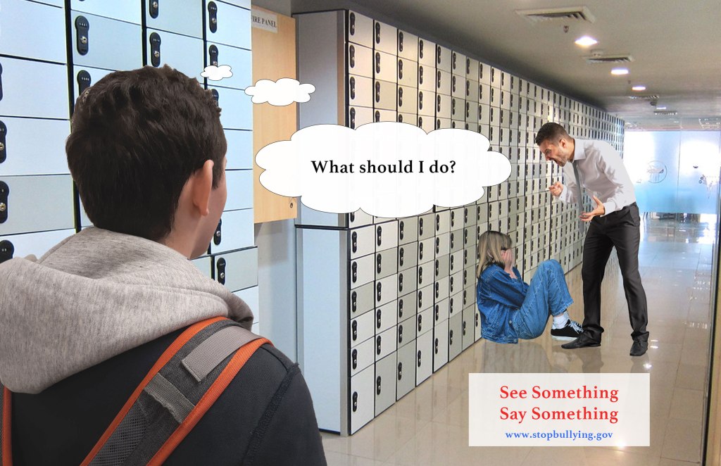
For my final poster project I decided I wanted to do a poster about bullying, more specifically in the realm of “See something say something”. It’s always bothered me when people notice something that should not be happening, yet chose not to say anything, so I decided I wanted to create a poster that highlights this. I first went online and found a photo of the hallway, little girl, and an adult man (teacher). The reason why I chose a teacher as the bully is to highlight that anyone can be a bully, and even if they’re someone in a higher up position, it’s not ok to bully someone. I then took a photo of one of my roommates for the student witnessing the act because I couldn’t find a photo online that would work with what I had in mind. After I got all the photos in, I made both the girl and the teacher have a reflection on the ground to make it more realistic. I also had to play with levels for the girl, student, and teacher to make them match to the background. I did this by making everything black and white to better see the contrast, and then I played with levels to match everything together. I then did a couple more tweaking and added some text and a thought bubble to really get my message across. I think for my first poster I did really well, and I’m happy with it.

For the pencil project, I followed the directions as closely as possible. I think I was pretty successful at matching the pencil to the instructions, the big difference I made of course was the coloring choices. I wanted to go for a more typical/classic looking pencil, which is why I chose more orange toned colors rather than pink. My gradient on the pencil is also different. I went for a more simple and subtle look with the gradient, especially toward the point part of the pencil (not the black tip part), I added a very slight gradient. Overall I’m very happy and satisfied with how my pencil turned out.
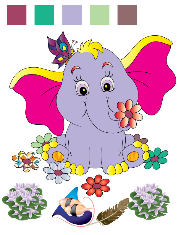
For the elephant project, I had a lot of fun of just trying different colors. It was kind of like doing a coloring book, but virtually. It was fun playing with already made gradients and patterns, and just seeing the different kinds. I would just choose colors I thought would look nice together, nothing too bold, but nothing quite pastel. I really liked the subtle gradients, like the yellow on the elephant’s toes and top of ears, it’s a very subtle yellow gradient and I really liked it.

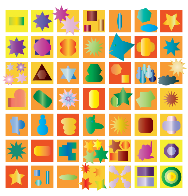
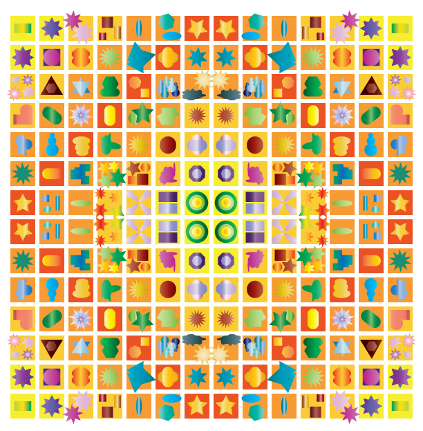
I think this is honestly my best work so far. I put it in way more time in this project than I had in previous projects. I wanted to make sure each shape was unique and that the color scheme worked and was consistent. I really liked the idea of having the general boxes have a gradient working with them, and originally the gradient was supposed to be from yellow to orange to green, but I liked how it looked when it went back to yellow instead of green, so I kept it yellow to orange back to yellow. To make the gradient affect, I highlighted certain boxes, chose a color, and made it darker and more orange as the gradient went on. I then made those colors spot colors so I could repeat the other side of the gradient more efficiently. As for the colors of the shapes, I was very intentional about color choices, and intentional about which areas had which colors. Some areas were more blue, some more purple, some more orange. Also, there are no solid colors within the shapes, they’re all gradients, some more subtle than others. I did original intend to use solid colors, but it just wasn’t as dynamic and it looked flat, so I ended up doing all gradients. Overall I’m really happy with how this project turned out, and I had a lot of fun completing it.
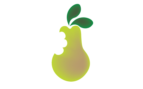
For the pear assignment, I struggled a bit to figure out how to curve the pen strokes. I kept trying to practice on my own, using the step by step instructions, but I kept struggling. Then I watched the video on blackboard, and after seeing how to curve the pen tool, it was much easier for me. I was able to quickly finish tracing the pear and leaf. I decided to add a second leaf to make the pear look more dynamic, and I went with pretty common pear and leaf colors, nothing crazy. I then used the mesh tool to make the pear and leaves stand out more and be less flat, and I was done. I would say I’m pretty satisfied with how it turned out. (Also, there might be some white spots on the pear, it’s why I made a second attempt. I don’t know if uploading them to blackboard caused them since when I look at the PDF on my hard drive the white spots are not there).
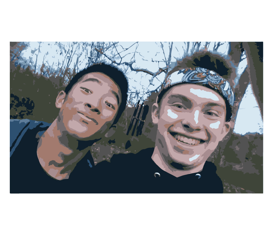
For my image trace project, I chose a photo that was special to me. In this photo is me and a foreign exchange student I hosted in 2018. We became really close and really good friends, and so it was fun editing this photo. I had fun playing with the different image trace filters, and I liked this version the best so I kept it.
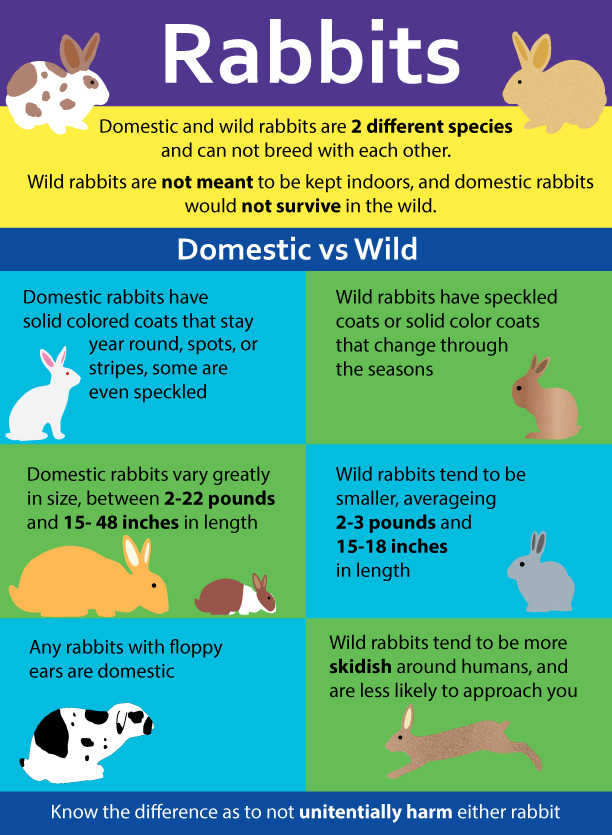
I really had a lot of fun with this project. For my infographic, I wanted to do something more light hearted and fun, and I’m kind of obsessed with rabbits, so I thought that would be a great topic for an infographic. I find it interesting the differences between wild and domestic rabbits, and I feel that not a lot of people know the differences, so I wanted to make a infographic highlighting that information. To do the rabbits, I downloaded free templates, then I colored them myself. To do the wild rabbits, I used some gradients, as well as the grain texture tool to make them looked speckled, like a wild rabbit would. For the domestic rabbits, I looked up common breeds then colored the rabbits with the patterns that I saw. For example, the big rabbit that is colored orange is based off the Flemish giant breed, which can be that color and can be up to 22 pounds. I then used colored boxes and texts to complete the infographic. I’m really happy with how it turned out, and thanks to some advice from my professor, the infographic really turned out amazingly, and is probably my best work from this class.

For the simple poster project I had fun just messing around with the different colors and fonts. The video was pretty easy to follow, and I thought it was neat how you could place in different types of files from different programs.

This is an example post, originally published as part of Blogging University. Enroll in one of our ten programs, and start your blog right.
You’re going to publish a post today. Don’t worry about how your blog looks. Don’t worry if you haven’t given it a name yet, or you’re feeling overwhelmed. Just click the “New Post” button, and tell us why you’re here.
Why do this?
The post can be short or long, a personal intro to your life or a bloggy mission statement, a manifesto for the future or a simple outline of your the types of things you hope to publish.
To help you get started, here are a few questions:
You’re not locked into any of this; one of the wonderful things about blogs is how they constantly evolve as we learn, grow, and interact with one another — but it’s good to know where and why you started, and articulating your goals may just give you a few other post ideas.
Can’t think how to get started? Just write the first thing that pops into your head. Anne Lamott, author of a book on writing we love, says that you need to give yourself permission to write a “crappy first draft”. Anne makes a great point — just start writing, and worry about editing it later.
When you’re ready to publish, give your post three to five tags that describe your blog’s focus — writing, photography, fiction, parenting, food, cars, movies, sports, whatever. These tags will help others who care about your topics find you in the Reader. Make sure one of the tags is “zerotohero,” so other new bloggers can find you, too.
Have a WordPress.com account? Log in now.

